
What Makes a Business Website Actually Effective?

When I'm judging whether my business website is actually doing its job, I want to know what really matters, so I know where to focus instead of guessing. That's a fair question, because "effective" gets attached to a lot of websites that don't earn it. A site can look sharp in a portfolio screenshot and still lose the person who lands on it thirty seconds later. Here's what separates a website that works from one that just looks like it should.
Effective Doesn't Mean Beautiful
Visual design matters, but it isn't the measure of whether a website works. A site can be visually striking and still lose visitors at every step, or look plain and quietly convert well because it gets the fundamentals right. Effectiveness comes down to whether visitors understand your offer and act on it, not how the homepage looks in isolation.
That's a useful reframe when you're evaluating your own site. Instead of asking whether it looks modern enough, ask whether someone unfamiliar with your business can tell what you do and know what to do next within a few seconds. Those are two different questions, and most redesigns only ever answer the first one.
Research from the Nielsen Norman Group backs this up: visitors typically decide within ten to twenty seconds whether a page is worth their attention, and that decision leans heavily on what's visible in the first screen, before any scrolling happens. Roughly 80% of the attention a page gets goes to content above the fold. If a visitor can't tell what you offer in that window, nothing else on the page gets a fair chance, no matter how well it's designed.
It Loads Fast, Especially on Mobile
Most business websites now get the majority of their traffic on mobile devices, often over inconsistent connections. A site that takes several seconds to become usable loses a meaningful share of visitors before they've seen anything, and that loss compounds because search engines also weigh loading speed when deciding which pages to show first.
Google's own research into Core Web Vitals found that shaving even a tenth of a second off load time can lift conversion rates by several percentage points on retail sites. Rakuten saw revenue per visitor jump 53% after speeding up how quickly its main page content appeared, and Yahoo Japan's page views per session rose 15% after fixing a layout-shift problem that had nothing to do with content, only with how quickly the page settled into place. Heavy, unoptimized images and bloated page code are the most common causes, and both are fixable without a full rebuild.
Jakob Nielsen, co-founder of the Nielsen Norman Group, put it plainly in the organization's research on response times: "A snappy user experience beats a glamorous one, for the simple reason that people engage more with a site when they can move freely and focus on the content instead of on their endless wait." Speed isn't a technical detail bolted onto a finished design. It's part of what the design is supposed to deliver.
It Explains What You Do in Seconds
Every effective business website answers three questions almost immediately: what you offer, who it's for, and why someone should care right now. Nielsen Norman Group's long-running research on reading behavior found that only 16% of visitors read a page word by word; the rest scan, picking out headings, bolded phrases, and the first few words of a sentence. If a visitor has to hunt for those answers, the page has already lost most of its value.
This is a writing problem before it's a design problem. Steve Krug, author of the usability classic Don't Make Me Think, Revisited, summed up the standard clearly: "If you can't make something self-evident, you at least need to make it self-explanatory." A homepage that says "We help growing e-commerce brands reduce cart abandonment" tells a visitor more in one sentence than a full paragraph of vague positioning ever will.
That scanning behavior also explains why layout matters as much as wording. Visitors tend to move in a rough Z or F shape across a page: top-left, sweeping right, then dropping down the left edge. Design that ignores this pattern often buries the most important sentence on the page in a sidebar or a footer, where scanning eyes rarely reach, and no amount of rewriting fixes a sentence nobody sees.
It Has One Clear Path to the Next Step
An effective website doesn't ask visitors to figure out what to do next. It shows them, consistently, through one primary call to action repeated at sensible points down the page. Competing buttons, vague labels, or a next step buried below the fold all add friction that a busy visitor won't push through.
- One primary action per page, stated in specific terms ("Request a Quote" rather than "Submit")
- The action repeated near the top and again after key sections, not just once at the bottom
- No more than one or two secondary actions competing for attention
The reason this works isn't complicated. Every extra choice on a page asks the visitor to stop and think, and stopping to think is exactly the moment most people click away instead. A single, well-labeled action removes that decision point before it can cost you the visitor.
It Builds Trust Before Asking for Anything
People contact a business once they feel reasonably confident it's legitimate and capable. Trust builds through specifics: real client examples, visible experience, clear service descriptions, and contact information that checks out. Generic claims and stock photography do the opposite; they make a real business look interchangeable with any other template site.
Most owners underestimate how often this decides whether someone reaches out. Baymard Institute's research into checkout and conversion behavior consistently finds that a lack of trust is one of the leading reasons visitors abandon a purchase or inquiry before completing it, right alongside price and unexpected costs. Closing that gap usually comes down to specificity, not volume of content. A few things build that credibility faster than most redesigns account for:
- A specific case study or before-and-after example, rather than a generic portfolio grid
- A real phone number, address and named contact, not just a contact form
- Third-party proof, such as reviews or client logos, placed near the decision point instead of buried on a separate page
You don't need a large portfolio to do this well. One or two genuine, specific examples of work, described honestly, will outperform a wall of vague testimonials every time.
It's Structured for Both Visitors and Search Engines
A well-structured page serves two audiences at once. Clear headings, a logical hierarchy, and descriptive page titles help visitors scan and find what they need fast. The same structure helps search engines understand what a page covers and when to show it. Effective websites don't treat these as separate concerns handled by different teams; they're built together from the start.
Google's own guidance for creators is consistent on this point: content built to be genuinely useful to a real audience, organized so both people and crawlers can follow it, tends to outperform content stitched together to chase a ranking. A page that reads clearly for a human visitor is usually the same page that ranks well, because the underlying signals overlap more than most site owners assume.
Worth checking
Open your homepage and skim only the headings. If they don't tell a coherent story on their own, a visitor scanning the page won't get one either.
It's Easy for Your Team to Keep Updated
A website that requires a developer for every small text change stops getting updated within a few months. Content goes stale, new services never get added, and the site slowly drifts out of sync with the business it's supposed to represent. Part of building something effective is making sure the people who need to update it actually can, without waiting on someone else's calendar.
In practice this usually comes down to the platform underneath the design. A content management system that lets someone edit a paragraph or swap a photo in a few clicks costs little extra to set up properly, and it pays for itself the first time a price changes or a new service needs a page. Ask during the build who on your team will actually make these edits, and confirm they can do it without filing a ticket first.
A Quick Self-Audit
If you want a fast read on where your own website stands, run through these questions honestly:
- Does the homepage explain what you do within the first screen, without scrolling?
- Is there one obvious next step, repeated more than once down the page?
- Does the site load in under a few seconds on a mobile connection?
- Is there at least one specific, real example of your work, not just general claims?
- Can someone on your team update text and images without needing a developer?
A no to two or more of these usually points to where a focused redesign would have the most impact, rather than a full ground-up rebuild of everything at once. Fix the weakest answer first, check whether it moves the numbers you actually care about, then move to the next one. Treat it as an ongoing habit rather than a one-time audit, since the answer to each question tends to drift as the site ages and nobody notices until traffic starts to slide.
Written by
Nexsols Analytics
Crafting Code, Creating Visibility
Ready to Talk About Web Design & Development?
See how we build sites structured around what visitors need to see first.

Should a Small Business Run an SEO Audit or a Full Website Redesign First?
Should you run an SEO audit or a full redesign first? Real cost ranges, recovery-time data, and a simple way to decide which one your site needs.
Read Article
10 Website Redesign Signs You Shouldn't Ignore (Plus a Free Self-Audit)
10 website redesign signs backed by real benchmarks, like bounce rate and Core Web Vitals, plus a free 5-minute self-audit and when not to redesign.
Read Article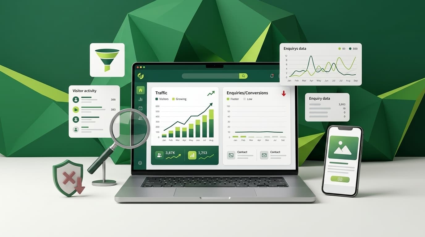
Why Your Website Gets Traffic but Few Enquiries
Traffic climbing while enquiries stay flat usually means wrong-intent keywords, unclear messaging or a weak call to action. Here's how to fix it.
Read Article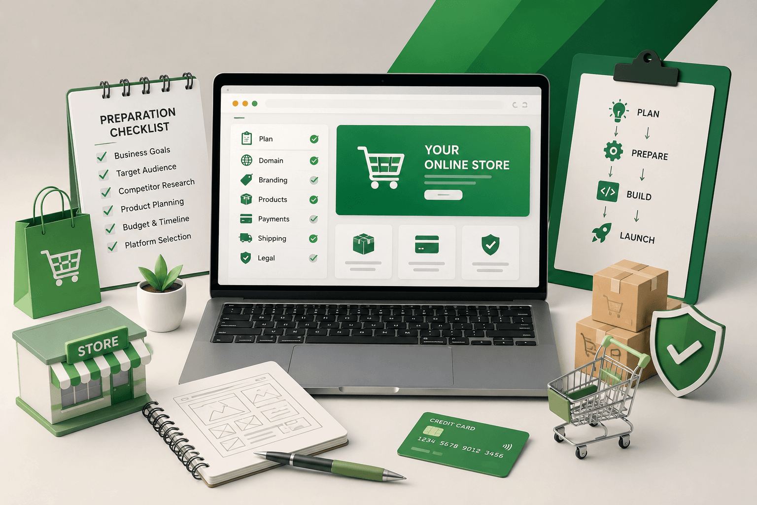
How to Prepare Your Online Store Before Development
A pre-development checklist for online stores: catalogue readiness, payments, shipping, product content and platform choice, so your build stays on schedule.
Read Article